A mobile app and web administration platform
One product serving daily communication, teaching workflows, campus services and management.
EDTECH PRODUCT DESIGN · MOBILE + WEB
EdTech App & Web Platform
Reframing a fragmented legacy education product into a coherent mobile and web experience for families, teachers and school administrators.
Explore the redesign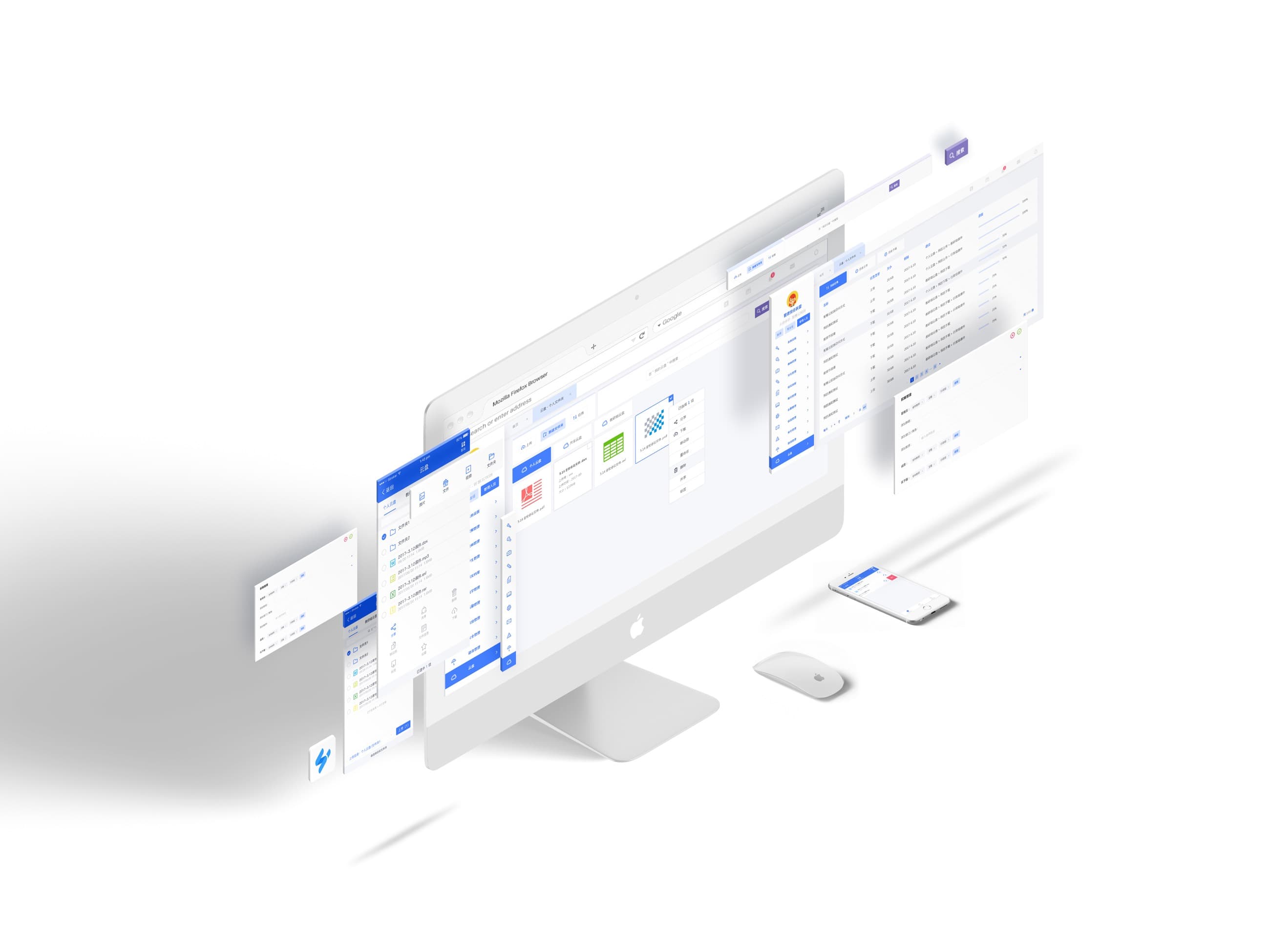

Liulian Campus brought communication, teaching, operations and administration into one cross-platform product ecosystem.
One product serving daily communication, teaching workflows, campus services and management.
Each role needed a different balance of immediacy, control, detail and data access.
The redesign replaced fragmented patterns with clearer structure and a shared visual language.
The project began as a redesign of an existing product. It became an exercise in rebuilding coherence across roles, workflows, devices and visual decisions.
Business context · Doubleflyer reports serving more than 100 education institutions. This is company-level context, not presented as a direct outcome of my redesign. Source ↗DESIGN QUESTIONHow might I preserve the depth of an existing education product while making the experience feel clear, trustworthy and usable across very different roles?
Before a Product Manager joined, I worked across workflow reconstruction, interaction structure and interface design, then translated the system into production-ready mobile and web UI.
Review inherited features and inconsistencies
Reorganise workflows and navigation
Create the full mobile and web interface
Deliver screens and logic to developers
As customer demand grew, I made the case for dedicated product ownership and supported the founders in hiring a Product Manager. After the role was established, I could focus more deeply on interface and visual quality while collaborating within a clearer product process.
DESIGN ALSO MEANS IMPROVING HOW A TEAM DESIGNS.There was no formal research programme. Product knowledge was distributed across the founders, engineers, sales conversations and the behaviour of the existing platform.
Business goals and product history
Technical logic and existing behaviour
Recurring customer needs and objections
Evidence of real tasks and friction
Parents needed fast reassurance; administrators needed control, density and traceability.
Mobile supported immediacy. Web supported long-form management, configuration and analysis.
Roles, permissions and feature groups were part of the experience, not back-office details.
Functional colours made dense schedules, modules and statuses easier to scan.
The redesign grouped a broad feature set into clearer mental models, then adapted those models to the needs of each role and platform.
 LIULIAN CAMPUSSHARED PRODUCT CORE
Messages, announcements, class circles and home-school updates.
Homework, Q&A, schedules, courses, resources and assessment.
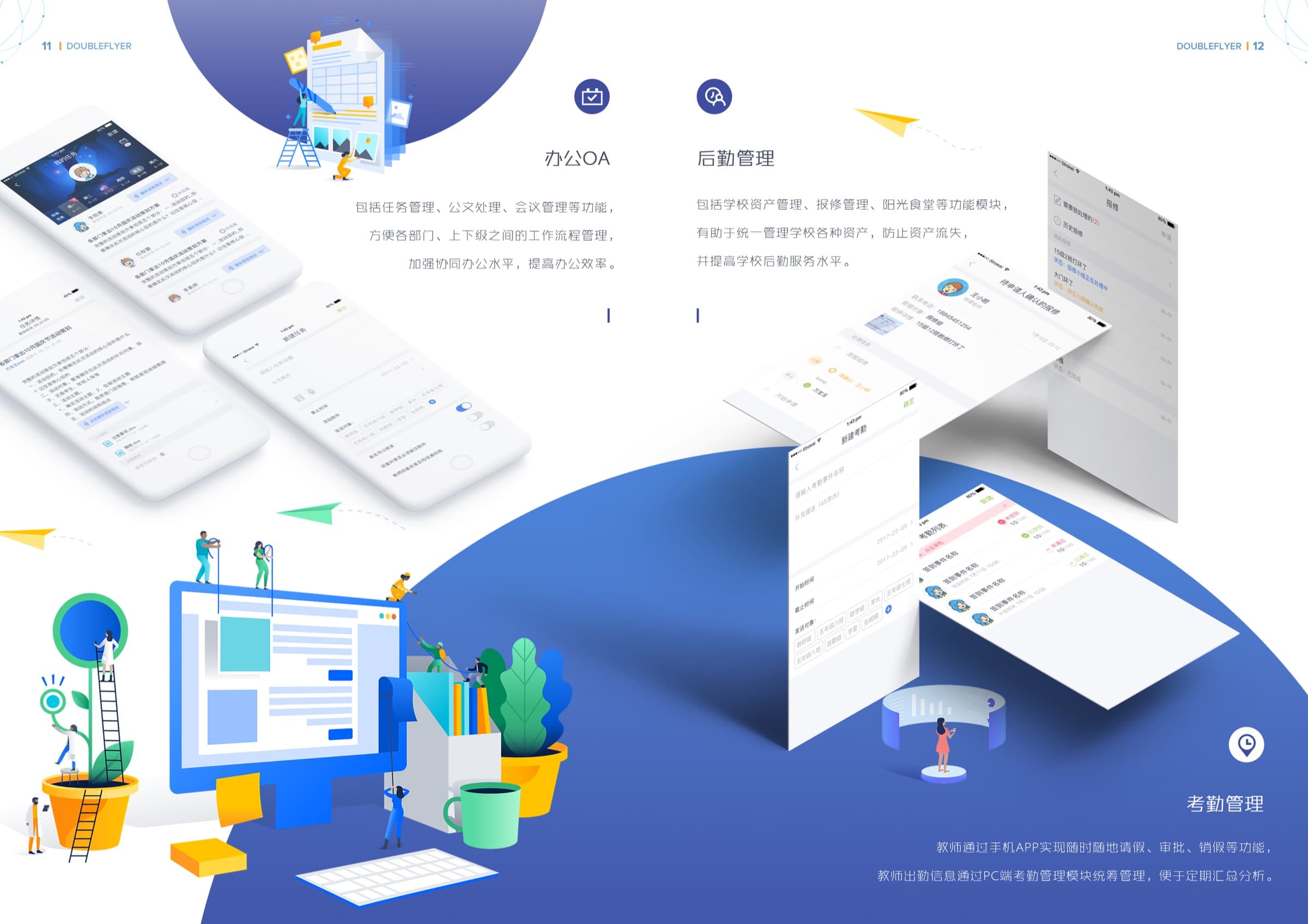
Leave, attendance, approvals, tasks, OA and campus services.
Permissions, records, grade analysis, reporting and configuration.
Messages, schedules, homework, leave and progress.
Communication, teaching, approvals and resource work.
Configuration, permissions, reporting and operations.
A shared palette keeps the experience recognisable, while each icon family responds to a different job: quick scanning in the product and expressive storytelling on the website.
Compact cues for frequent tasks and fast recognition.
 Grade analysis
 Leave request
 Homework
 Evaluation
 Attendance
 Campus service
 News
News Notices
Friendly feature stories with a more expressive character.
 Class circle
 Task management
 Online Q&A
 Student leave
 Scan attendance
 Repair service
 Campus news
 Campus notices
The mobile experience prioritised immediate information, frequent actions and a more approachable tone for families and teachers.
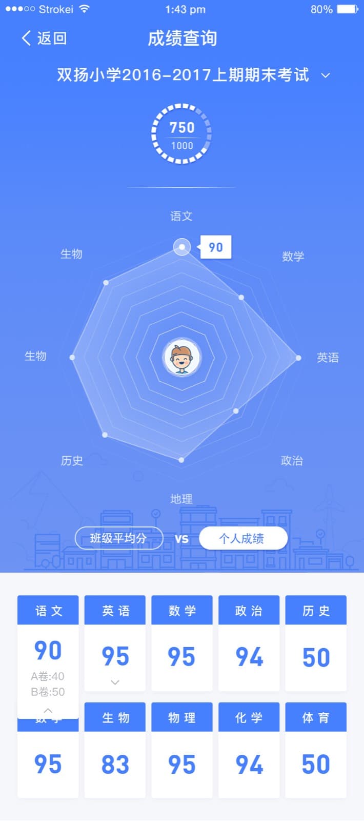
Frequent actions stay visible and close to the home screen.
Avatars, colour and illustration soften institutional workflows.
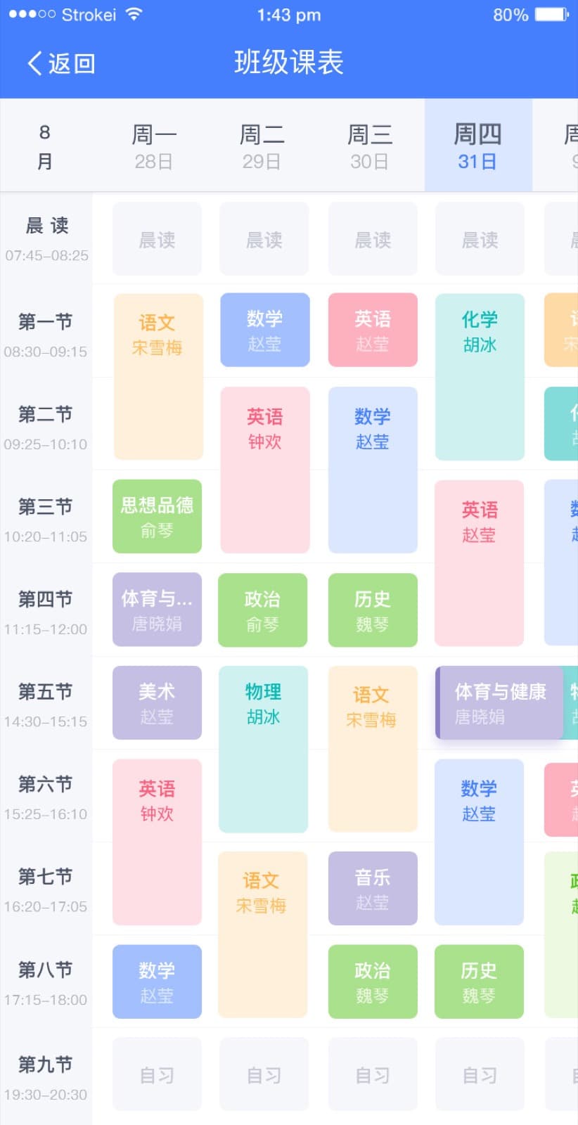
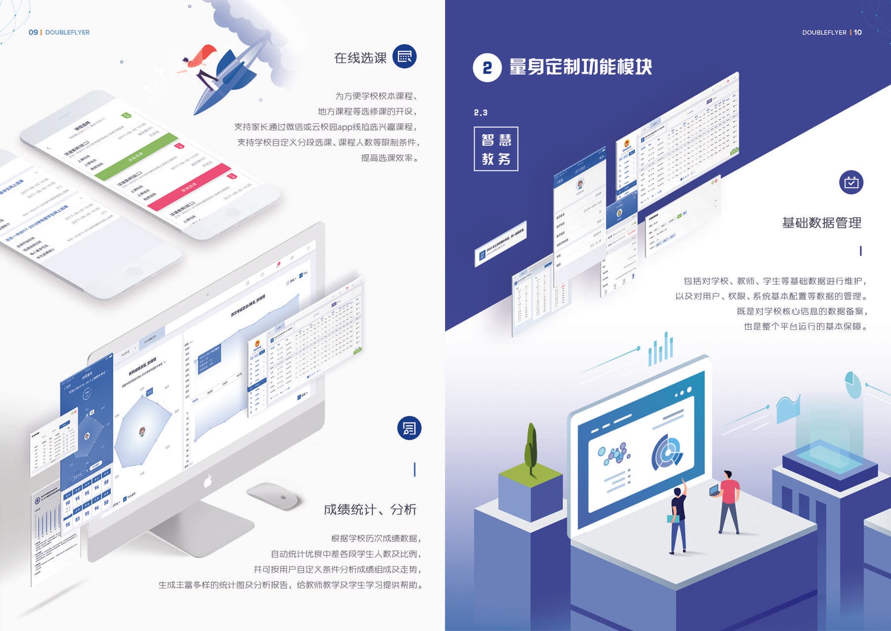
Charts and schedules turn school data into recognisable patterns.
The web platform supported dense administration tasks through stable navigation, modular content areas and consistent table, form and data patterns.
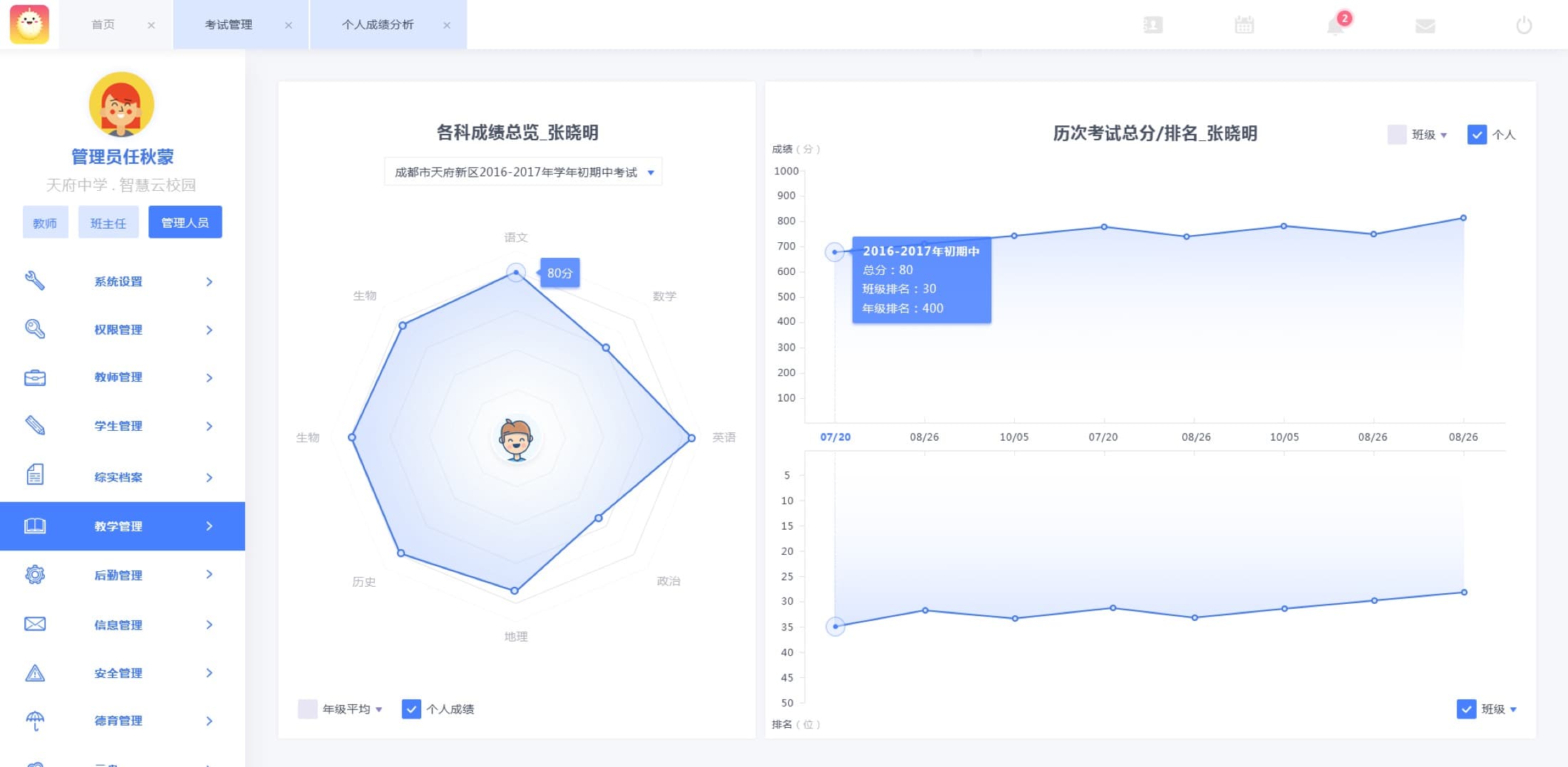
Individual performance combines a subject profile with change over time, giving teachers a clearer basis for discussion.
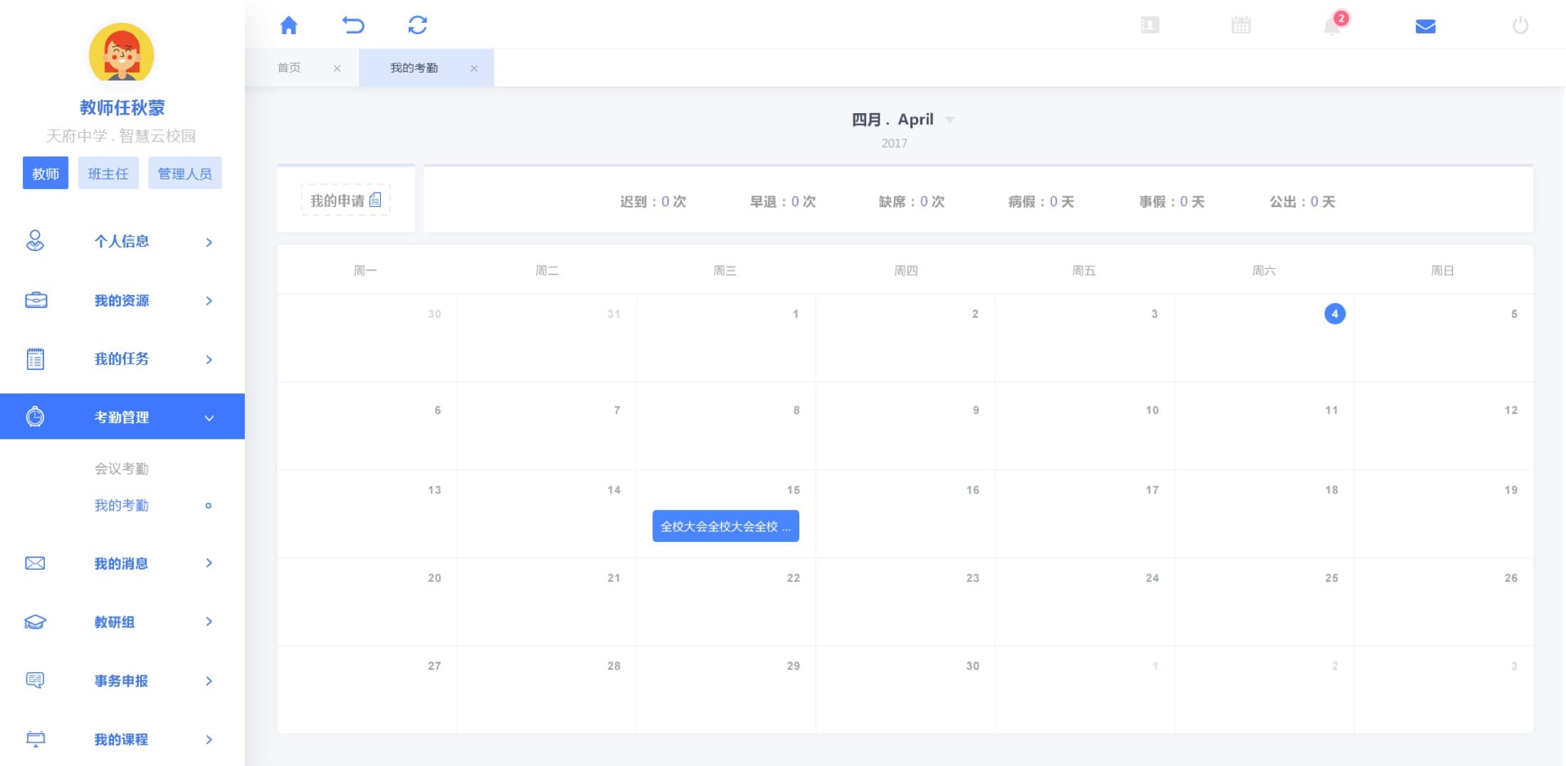
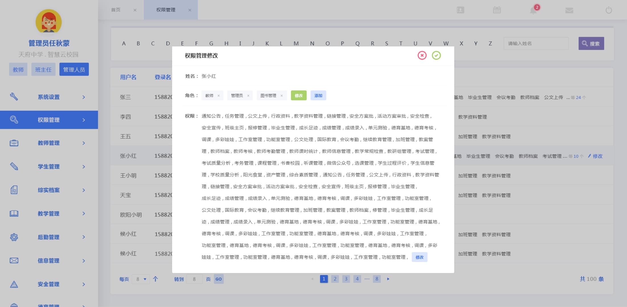
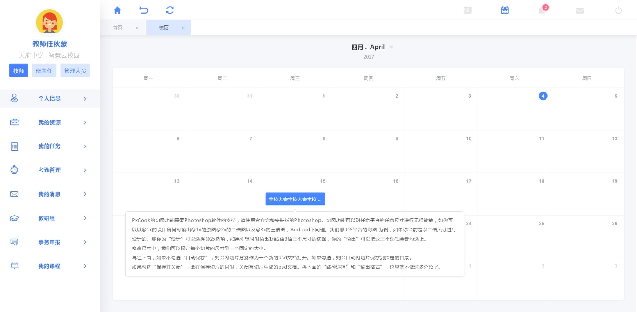
I carried the same visual language into launch imagery, presentation boards and sales materials so the experience remained coherent from product demonstration to daily use.
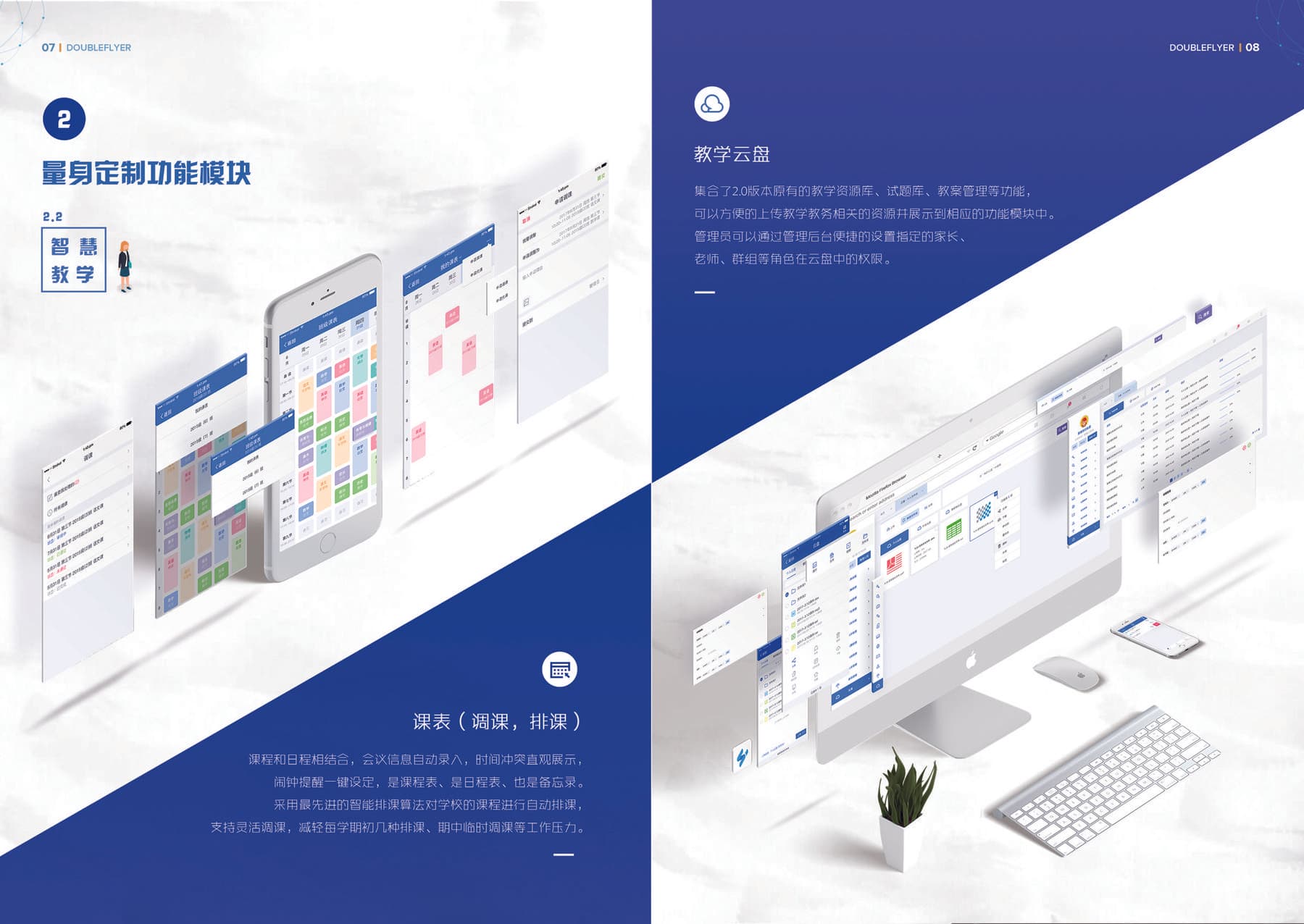
The real design challenge was not any individual screen. It was creating coherence across people, responsibilities, workflows and devices, while helping the team establish a clearer way to make product decisions.